Kitchen Design Color for 2017
Kitchen Design Trends
Glorious Greenery Wins Color of the Year – 2017
Known as a color authority in fashion, graphic, and interior design, Pantone has been picking a color of the year since 2000, and the Pantone Color of the Year for 2017 is “Greenery.”

Greens are symbolic of nature, growth, harmony, freshness, environmentalism, and energy and can also symbolize the reconnection we seek with nature, one another, and a larger purpose. This year’s Greenery is invigorating with zesty undertones. It’s a surprise departure from the tranquil colors of previous years. Greenery grabs the attention and brings joy, like the fresh spring shoots emerging from grey winter soil. In a similar way, it will breathe new life into any design scheme.
So how can you work this new color into upcoming kitchen design or kitchen remodeling projects? Highly usable Greenery, with its yellow-green hue, can make a great primary color or it can be blended into existing palettes. Kitchen & Bath Creation’s Designers give up their tips and tricks for “going green” in 2017. Here are five ways to incorporate Greenery into your design or color pallet–some are bold; some are subdued; and all look cool!
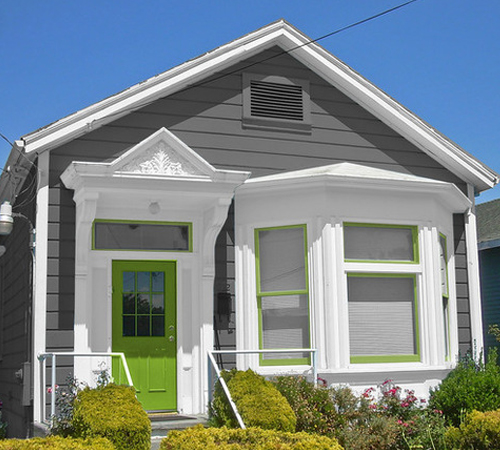
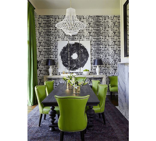
M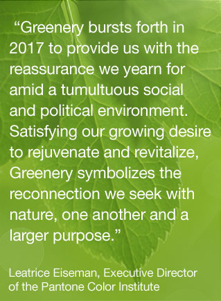 ake a Bold Statement
Green is a fun and engaging color, making it an easy choice if you really want to go big with it in your palette. If you’re swooning over this bright, yellowy shade of green, then maybe you want to use it in a big way. Why not try a bold wallpaper in your powder room, or create some buzz in the neighborhood with a freshly painted front door?
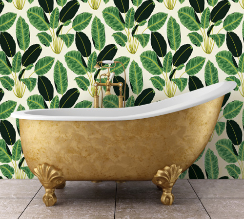
Keep It Simple
If you like this green feel it may be a bit too intense in large doses, you can use Greenery to simply enhance your existing design. Adding smaller touches of Pantone’s Color of the Year can add a pop of brightness and a bit of freshness to your home.
To incorporate this color naturally, opt for accents. One of the easiest ways to do this is literally—succulents and other greenery add life and interest to any room. Aside from actual greenery, you can bring this color in through smaller, quieter ways, such as a vase or tray, decorative pillows, curtains, light fixtures, rugs, table settings, paintings, and other elements. Accessorizing with Greenery is an effortless way to invest in this year’s newest hue without a big commitment.
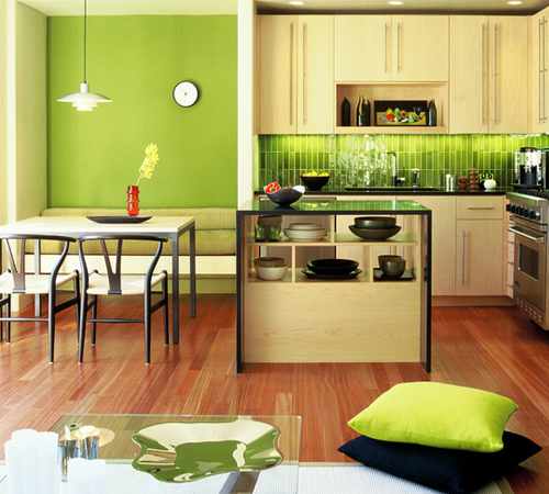
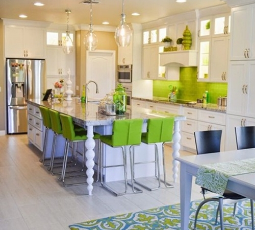
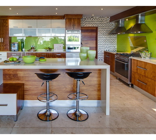
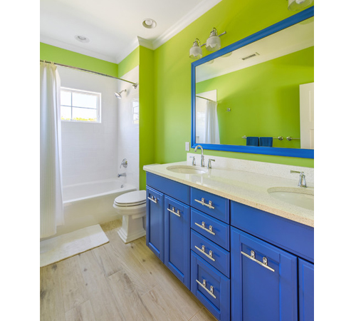
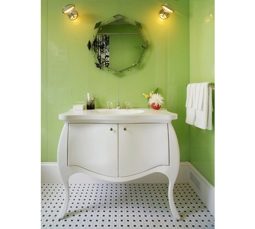
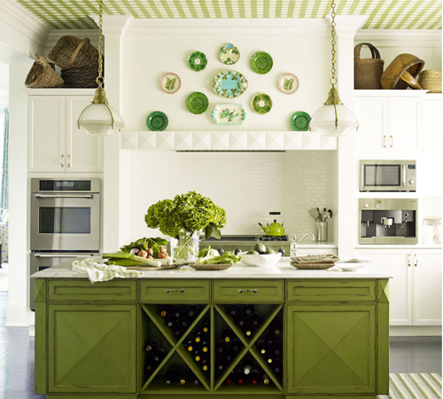
Incorporate as an Accent Hue
Trend savvy KBC designers are encouraging homeowners to move on from all-white interiors and think about accentuating their design with color. A splash of green can add vibrancy and keep kitchens and baths from looking sterile or cold. Fortunately, this year’s Greenery complements many colors and would easily fit into various room types. Whether you decide to paint a ceiling or wall in a room, add a kitchen backsplash, or painted bathroom vanity, be sure to choose at least three different items that share this color to tie the look together.
Use as a Neutral
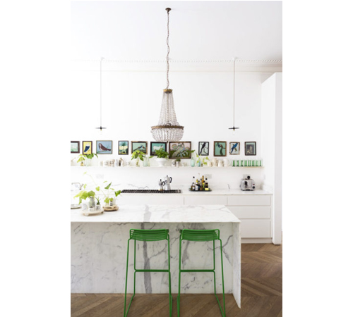
Greenery is very versatile and tends to work as a semi-neutral. The great thing about a more neutral color choice is that it won’t overwhelm the design, making it easier for you to use it in concert with other elements of your kitchen or throughout your home. A “new neutral,” Greenery can be used as a background or fade-away color with ease and also manages to work well with the warm wood tones that may currently exist in your home design. It can be pleasingly paired with many other colors. Greens—and this green in particular—have a pretty neutral vibe, making it easy to add other colors to the palette. As in nature, it’s right at home with shades of red, orange, yellow or blue.
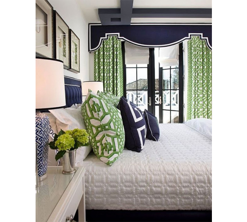
Mix & Match
Greenery’s versatility makes pairing it pretty easy. Pantone offers color pairings on their website, matching greenery with softer colors like light grays and last year’s colors of the year, serenity and rose quartz, to mellow it out. Black, white, and neon are great if you’re looking to rev up greenery, while pairing it with warm neutrals gives it an earthy, rooted feel. There are endless possibilities when it comes to mixing and matching with this color; here are a few designer favorites:
- Greenery goes great with navy for a classic look.
- You can pair it with pink for more of an island look.
- It goes well with gray for a mid-century look.
- It’s fresh and modern with white for those with more contemporary tastes.
Whether you want to make a big splash or just dip your toe into the Greenery “design pool,” there’s an option that’s perfect for you. Will you give Pantone’s 2017 Color of the Year the “green light” in your next decorating project? We hope we’ve inspired you to visit our showroom where a KBC designer would love to help you create the kitchen or bathroom of your dreams in 2017.
Tags: Kitchen Color Schemes, Kitchen Design, Kitchen Remodel, Paint Colors
